After pitching alongside some other graphic designers a logo which would feature on cereal packaging for nutrition and excercise enthusiastics, the opportunity to further develop the logo, as well as design the packaging arose.
The logo which is bouncy and light stands apart from other logos that promote energy boosting products - serious and often dull.
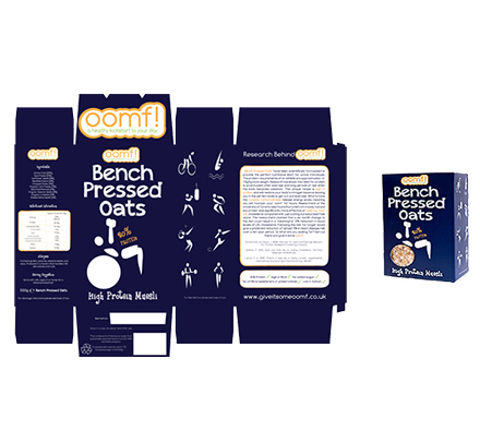
The packaging drew inspiration from the well known products such as dorset cereals, the main concept being to make product look fun and tasty while clearly promoting that it could be suitable for those undertaking sports training. The packaging left is the final design and the cereal is now retailing in GNC stores throughout the UK.